14TH OCTOBER 2019
14TH OCTOBER 2019
HYBRIDITY
HYBRIDITY
PROJECT TITLE
GREYFRIAR'S GREEN HYBRID CIVIC SPACE
PROJECT TITLE
CLIENT
COVENTRY COUNCIL
GREYFRIAR'S GREEN HYBRID CIVIC SPACE
CLIENT
LOCATION
COVENTRY- United Kingdom
COVENTRY COUNCIL
LOCATION
COVENTRY- United Kingdom
The client for this project clearly instructed our design team that they required a social eating space that also allowed for a residential space. Our design team however wanted to take this further and allow for an integrated social space that would in turn improve the flow and traffic of the public through the city centre of Coventry.
The project involved creating a housing establishment on a site established close to the motorway in Coventry. After primary and secondary research of the diverse population within Coventry and the food interest, it has. A focus on cultural eating was established and was used as a tool to bring people together in the atrium space where stalls are positioned, they can cook for each other and be involved within the process.
Creating a permeable open inviting social space was crucial to the success of the project which transferred in to the use of curved glass panels and a tensile fabric roof to promote fluidity that helped create bright and airy conditions for such social interactions to take place.
The rigid sections of the project such as the housing units required more privacy and subtle measures have been taken to ensure this such as the use of frosted glass, change of levels. These units involved the use of 3D printing as a structural tool which was a lot more efficient, reliable and a cheaper alternative than regular building procedure which ensured the project to be handed on time and lower than the anticipated budget.
STAGE 1
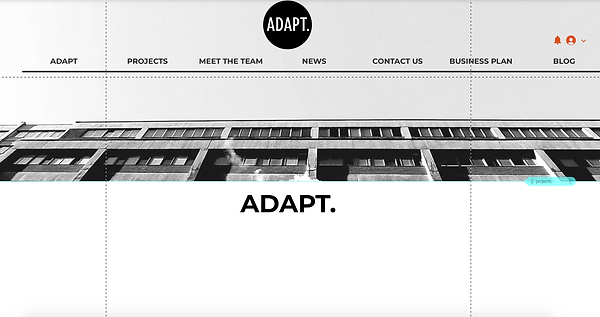
INITIALLY, WE BEGAN THE DESIGN PROCESS WITH OUR PREVIOUS WEBSITE LAYOUT. I CHOSE THE PREVIOUS LAYOUT DUE TO HOW GRAPHICALLY FORWARD AND VISUALLY FOCUSED IT WAS, WHICH AT THE TIME SEEMED TO FIT OUR URBAN CONTEMPORARY CRITERIA.
ALTHOUGH WE SAT ON THIS DESIGN FOR A WHILE, I REALISED THAT ESSENTIALLY THIS WEBSITE DESIGN WAS JUST NOT SUITABLE AT ALL. ALTHOUGH VISUALLY APPEALING, IT WAS NOT SO EASY TO NAVIGATE OR READ DUE TO UNDERLYING VISUALS. THEREFORE, THIS WAS NOT SUITED FOR A PROFESSIONAL WEBSITE.
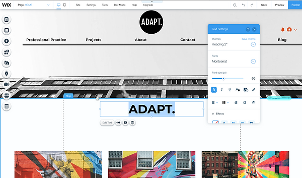
THE MORE AND MORE I ADDED AND EDITED THE SITE IT JUST SEEMED MORE CROWDED AND WAS GETTING NOWHERE. SO, THE NEXT STAGE WAS TO REGROUP, DISCUSS AND GET EVERYONE TO ACTUALLY LOOK AT ALL THE WIX SITE TEMPLATES AND TO AGREE ON ONE. SOME MEMBERS OF THE GROUP WOULD LIKE ELEMENTS OF A TEMPLATE SUCH AS THE HOVER OVER BOXES WHICH I THEN ASSURED THEM THAT I COULD CREATE ON ANY TEMPLATE AS THEY WERE JUST ADDED FEATURES.
WE SAT, WE DISCUSSED AND WE DEBATED WHAT WE LIKED ABOUT EACH TEMPLATE SEEN BELOW.
DESPITE THE FACT THAT THE MAIN ISSUE WITH THE PREVIOUS WEBSITE WAS BECAUSE IT WAS TOO VISUAL, WE WERE STILL DRAWN TO THE WHOLE VISUAL FOCUS ELEMENT. WE LOVED THE IDEA OF HAVING A MOVING IMAGE TO PORTRAY THE WHOLE 3D ELEMENT OF OUR COLLECTIVE, HOWEVER WE STILL NEEDED TO MAINTAIN THE DESIRE OF BEING LOOKED AT AS PROFESSIONAL.


SOME DESIGNS SEEMED TOO PORTFOLIO FOCUSED AND SOME DESIGNS JUST DIDN'T WORK BECAUSE ELEMENTS WOULD OVERLAP AND THROW US COMPLETELY OFF LIKING THE DESIGN. HOWEVER, WE WERE ALSO LOOKING AT WHICH TEMPLATED WOULD BE TABLET/ MOBILE FRIENDLY AND WHICH TEMPLATES WOULD ALLOW FOR EASE OF ACCESSIBILITY.


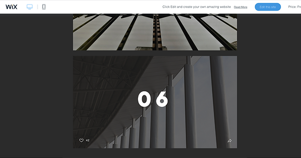
IN THE END, AFTER A LONG LIST OF WHAT WE LIKED AND DISLIKED FROM THE TEMPLATES, WE EASILY AGREED ON TEMPLATE "ARTISTIBAMM" (SEEN BELOW). WE CHOSE THIS TEMPLATE DUE TO HOPE SIMPLISTIC YET VISUALLY ATTRACTIVE, AS WELL AS HOW TECHNICAL OF AN AESTHETIC THE TEMPLATE PROVIDED.


