14TH OCTOBER 2019
14TH OCTOBER 2019
HYBRIDITY
HYBRIDITY
PROJECT TITLE
GREYFRIAR'S GREEN HYBRID CIVIC SPACE
PROJECT TITLE
CLIENT
COVENTRY COUNCIL
GREYFRIAR'S GREEN HYBRID CIVIC SPACE
CLIENT
LOCATION
COVENTRY- United Kingdom
COVENTRY COUNCIL
LOCATION
COVENTRY- United Kingdom
The client for this project clearly instructed our design team that they required a social eating space that also allowed for a residential space. Our design team however wanted to take this further and allow for an integrated social space that would in turn improve the flow and traffic of the public through the city centre of Coventry.
The project involved creating a housing establishment on a site established close to the motorway in Coventry. After primary and secondary research of the diverse population within Coventry and the food interest, it has. A focus on cultural eating was established and was used as a tool to bring people together in the atrium space where stalls are positioned, they can cook for each other and be involved within the process.
Creating a permeable open inviting social space was crucial to the success of the project which transferred in to the use of curved glass panels and a tensile fabric roof to promote fluidity that helped create bright and airy conditions for such social interactions to take place.
The rigid sections of the project such as the housing units required more privacy and subtle measures have been taken to ensure this such as the use of frosted glass, change of levels. These units involved the use of 3D printing as a structural tool which was a lot more efficient, reliable and a cheaper alternative than regular building procedure which ensured the project to be handed on time and lower than the anticipated budget.
STAGE 2


AFTER IMPROVING OUR WEB DESIGN, THE NEXT STEP WOULD BE TO CREATE A UNIQUE AND EYE CATCHING LOGO.
FOR THIS, I WANTED TO CREATE A LOGO THAT IS REPRESENTATIVE OF OUR BRAND AND WHAT WE DO / WHAT WE STAND FOR.
STARTING WITH A BASIC 'A', I THEN PLAYED AROUND WITH 3D FORM AND CREATING A WAY TO PORTRAY OUR UNIQUE 3D PRINTING SERVICES. I MOVED AWAY FROM THE BASIC 'A' FORM AND THEN PLAYED AROUND WITH OUR COLLECTIVE CHARACTER OF BEING A DYNAMIC MULTIDISCIPLINARY GROUP. I REPRESENTED THIS ELEMENT BY NOT COMPLETING THE 'A' SHAPE AND ALLOWING FOR GAPS IN THE STRUCTURE WHICH ALLOWS FOR FLUIDITY AND TRANSPARENCY IN OUR DESIGNS. ADDITIONALLY, THE 3D BLOCK ELEMENTS WERE AN ADDITION INTO THE IDEA OF CREATING SOMETHING NEW FROM SOMETHING OLD AND PLAYING ON THE BESPOKE 3D FORM ATTACHMENTS ONTO A PREEXISTING FORM.


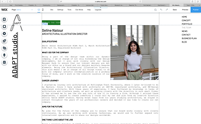
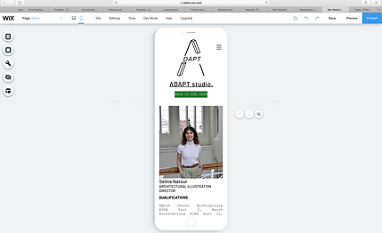
AFTER THE LOGO WAS PERFECTED AND FINALISED, I BEGAN CREATING THE TEAM PROFILES FOR EVERYONE WITH THE ROLES WE HAD DESIGNATED. I DIRECTED THE PHOTOSHOOT FOR OUR GROUP AND CHOSE LOCATION IN ORDER TO CREATE THE SENSE OF BEING IN A WORKPLACE PROFESSIONAL ENVIRONMENT. FROM LIGHTING TO POSITIONING, I WANTED TO ALLOW FOR AN ELEGANT YET FUN WAY TO SHOW OUR DIVERSE AND MULTI SKILLED GROUP.
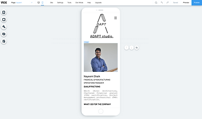
CONSTANTLY CHECKING THAT THE DESKTOP AND MOBILE INTERFACES ARE CORRESPONDING WAS A BIT OF AN ISSUE FOR THIS PAGE DUE TO THE WRITING FORMAT AND THE IMAGES. HOWEVER THIS WAS A PROBLEM QUICKLY RESOLVED. ONE THING I DID LEARN IN THIS PROCESS WAS THAT THE BUTTONS SEEMED TO AUTOMATICALLY PIN THEMSELVES TO THE PAGES ON THE MOBILE INTERFACE AND THIS CAUSED FOR OVERLAPPING.

FOR THE TEAM PAGE, I ALSO WANTED TO CREATE A DIRECTORS STATEMENT IN ORDER TO MAKE THE COLLECTIVE SEEM MORE PERSONAL AND TO ALLOW FOR READERS TO UNDERSTAND WHY WE HAVE CREATED OUR COMPANY, AS WELL AS TO UNDERSTAND WHAT OUR VALUES ARE AS DIRECTORS AND NOT JUST AS A COLLECTIVE COMPANY IN TERMS OF DESIGN.
MY IDEA OF ADDING SIGNATURES TO THE BOTTOM OF THE PAGE ALSO ALLOWS FOR A MORE PERSONAL AND PROFESSIONAL FEEL.


MY CURATION OF THE TEAM PHOTOS AND MY DIRECTION OF THE PORTRAITS WAS AIMED AT CREATING A PROFESSIONAL AND YET CALMING ATMOSPHERE WHICH IS WHAT WE LIKE TO PORTRAY WITH OUR COLLECTIVE. THE LIGHTING AND THE COLOURS IN THE PHOTOGRAPHS WERE PERFECTLY TONED TO CREATE THIS ATMOSPHERE. I DID ALSO EDIT THESE IMAGES IN ADOBE LIGHTROOM TO ALLOW FOR A UNIFORM FILTER TO BE APPLIED TO ALLOW FOR A UNIFORM WEBSITE AESTHETIC.
